
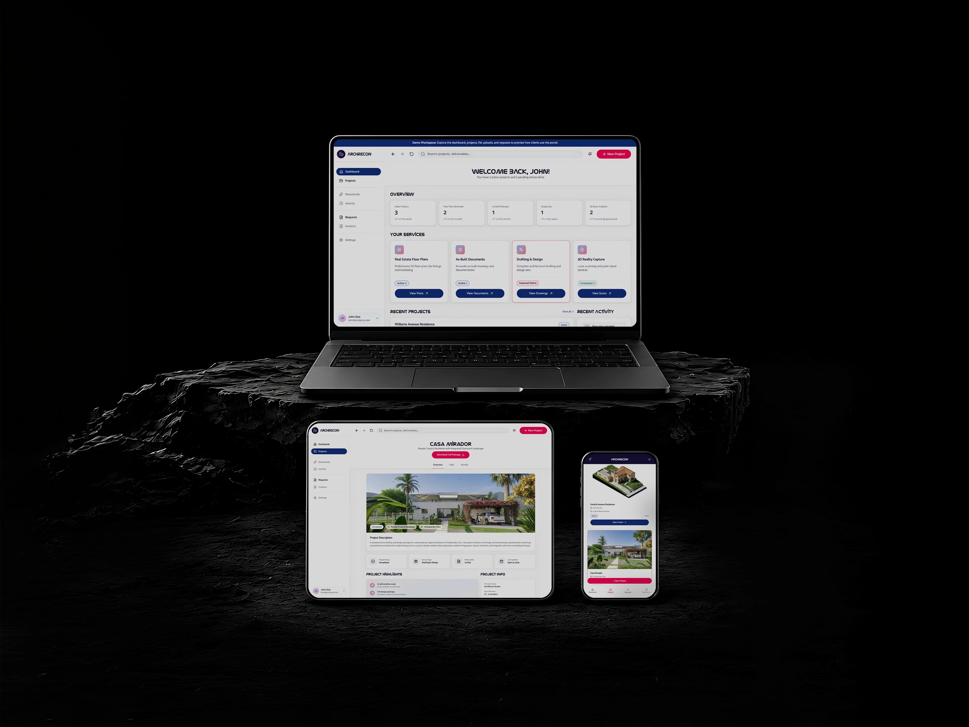
ArchRecon Portal
Type
Saas MVP
Timeline
4 weeks
Client
ArchRecon
Date
Spring 2026
Challenge
ArchRecon is an AEC design and documentation service firm whose services, projects, files, and requests were fragmented across emails, folders, and manual communication, leaving clients without one clear place to manage their work.
Solution
We designed and developed a client portal MVP where customers can manage projects, access deliverables, and submit requests- creating a scalable foundation for ArchRecon’s growth.
Team& Role
As the Product Designer, I worked with the Lead Product Designer to translate product requirements into clear workflows and responsive interfaces. I also owned the design system and collaborated with development to ensure accurate front-end implementation.
Research Synthesis
Based on user research findings, transparency, self-service, affordances, and collaboration potential were valued and needed.
Impacts
94% task completion
87+ System Usability Score (SUS)
8.6/10 average recommendation score
Decision 1
Our first major product decision was to centralize visibility by creating one consistent client-facing portal, replacing the disconnected paths created by multiple users, services, and file-sharing platforms.

To create such visibility, the dashboard immediately shows clients what’s active, delivered, still in progress, and where to go next.
Desktop presents a broader overview of metrics, services, projects, and activity, while mobile prioritizes the most frequent actions in a compact, easy-to-scan layout.
Test Results
87+ System Usability Score (SUS): Users found the interface intuitive and easy to use, with clear navigation across projects, files, and service requests.
Testing showed that users expected the service cards to act as direct entry points to their projects and deliverables.
In the high-fidelity designs, we strengthened labels, status indicators, calls to action, and interactive states.
We also placed summary information first so clients could understand their overall activity before quickly accessing specific services or projects.
Test Results
87+ System Usability Score (SUS): Users found the interface intuitive and easy to use, with clear navigation across projects, files, and service requests.
Testing showed that users expected the service cards to act as direct entry points to their projects and deliverables.
In the high-fidelity designs, we strengthened labels, status indicators, calls to action, and interactive states.
We also placed summary information first so clients could understand their overall activity before quickly accessing specific services or projects.
Test Results
87+ System Usability Score (SUS): Users found the interface intuitive and easy to use, with clear navigation across projects, files, and service requests.
Testing showed that users expected the service cards to act as direct entry points to their projects and deliverables.
In the high-fidelity designs, we strengthened labels, status indicators, calls to action, and interactive states.
We also placed summary information first so clients could understand their overall activity before quickly accessing specific services or projects.
Decision 2
We organized the portal around three core client needs: understanding project status, accessing active work, and submitting requests. The MVP prioritized these essential workflows while reserving secondary features for future phases.

The project overview gives clients a clear snapshot of each project- including its status, service, deliverables, and latest updates- before they move into files or activity.
Desktop displays more project details at once, while mobile prioritizes essential context and actions.
The file viewer lets users preview individual deliverables while keeping file details, versions, downloads, and sharing options accessible.
Desktop shows supporting information alongside the preview, while mobile prioritizes the asset and primary actions.
Test Results
94% Task Completion Across Core Workflows: Validating that users could successfully navigate projects, access files, and submit requests without assistance.
Testing revealed that users needed project context before deciding what to download and often wanted a single revised file rather than the entire AEC package.
We redesigned the overview to include status, highlights, services, project details, and activity, while supporting both individual file and full-package downloads for greater flexibility.
Test Results
94% Task Completion Across Core Workflows: Validating that users could successfully navigate projects, access files, and submit requests without assistance.
Testing revealed that users needed project context before deciding what to download and often wanted a single revised file rather than the entire AEC package.
We redesigned the overview to include status, highlights, services, project details, and activity, while supporting both individual file and full-package downloads for greater flexibility.
Test Results
94% Task Completion Across Core Workflows: Validating that users could successfully navigate projects, access files, and submit requests without assistance.
Testing revealed that users needed project context before deciding what to download and often wanted a single revised file rather than the entire AEC package.
We redesigned the overview to include status, highlights, services, project details, and activity, while supporting both individual file and full-package downloads for greater flexibility.
Decision 3
The third decision introduced a self-service request flow, allowing clients to start new work directly within the portal. Submitted requests enter ArchRecon’s pipeline and return clients to the dashboard, creating a continuous workflow.

To reduce the ambiguity of a blank form, the request flow begins with service selection before collecting project details, notes, and files.
Desktop presents the steps together, while mobile uses a simpler sequence, with clear selection states and validation to help prevent incomplete submissions.
Test Results
8.6/10 Average Recommendation Score: showing strong user confidence and perceived value in the platform experience.
We designed a client portal MVP that gives customers a modern workspace to manage projects, view deliverables, and submit requests; while creating a scalable foundation for future growth.
Participants expected confirmation and next-step details after submitting, so we introduced a submission summary with a clear response timeline.
We designed a client portal MVP that gives customers a modern workspace to manage projects, view deliverables, and submit requests; while creating a scalable foundation for future growth.
Test Results
8.6/10 Average Recommendation Score: showing strong user confidence and perceived value in the platform experience.
We designed a client portal MVP that gives customers a modern workspace to manage projects, view deliverables, and submit requests; while creating a scalable foundation for future growth.
Participants expected confirmation and next-step details after submitting, so we introduced a submission summary with a clear response timeline.
We designed a client portal MVP that gives customers a modern workspace to manage projects, view deliverables, and submit requests; while creating a scalable foundation for future growth.
Test Results
8.6/10 Average Recommendation Score: showing strong user confidence and perceived value in the platform experience.
We designed a client portal MVP that gives customers a modern workspace to manage projects, view deliverables, and submit requests; while creating a scalable foundation for future growth.
Participants expected confirmation and next-step details after submitting, so we introduced a submission summary with a clear response timeline.
We designed a client portal MVP that gives customers a modern workspace to manage projects, view deliverables, and submit requests; while creating a scalable foundation for future growth.
Design Systems
We built the design system around an 8-point grid, typography, radius rules, and reusable component states. Applying it across key components kept the product consistent and scalable across desktop and mobile.
Lessons Learned
Simplifying complex AEC workflows into clear tasks improves usability, builds trust, and reduces project friction.
Future Opportunities
Expand the portal with messaging, collaboration, integrations, and analytics to improve engagement and efficiency.
Personal Growth
Strengthened my ability to turn technical workflows into scalable experiences that balance user and business needs.

ArchRecon Portal
Type
Saas MVP
Timeline
4 weeks
Client
ArchRecon
Date
Spring 2026
Challenge
ArchRecon is an AEC design and documentation service firm whose services, projects, files, and requests were fragmented across emails, folders, and manual communication, leaving clients without one clear place to manage their work.
Solution
We designed and developed a client portal MVP where customers can manage projects, access deliverables, and submit requests- creating a scalable foundation for ArchRecon’s growth.
Team& Role
As the Product Designer, I worked with the Lead Product Designer to translate product requirements into clear workflows and responsive interfaces. I also owned the design system and collaborated with development to ensure accurate front-end implementation.
Research Synthesis
Based on user research findings, transparency, self-service, affordances, and collaboration potential were valued and needed.
Impacts
94% task completion
87+ System Usability Score (SUS)
8.6/10 average recommendation score
Decision 1
Our first major product decision was to centralize visibility by creating one consistent client-facing portal, replacing the disconnected paths created by multiple users, services, and file-sharing platforms.
To create such visibility, the dashboard immediately shows clients what’s active, delivered, still in progress, and where to go next.
Desktop presents a broader overview of metrics, services, projects, and activity, while mobile prioritizes the most frequent actions in a compact, easy-to-scan layout.
Test Results
87+ System Usability Score (SUS): Users found the interface intuitive and easy to use, with clear navigation across projects, files, and service requests.
Testing showed that users expected the service cards to act as direct entry points to their projects and deliverables.
In the high-fidelity designs, we strengthened labels, status indicators, calls to action, and interactive states.
We also placed summary information first so clients could understand their overall activity before quickly accessing specific services or projects.
Test Results
87+ System Usability Score (SUS): Users found the interface intuitive and easy to use, with clear navigation across projects, files, and service requests.
Testing showed that users expected the service cards to act as direct entry points to their projects and deliverables.
In the high-fidelity designs, we strengthened labels, status indicators, calls to action, and interactive states.
We also placed summary information first so clients could understand their overall activity before quickly accessing specific services or projects.
Test Results
87+ System Usability Score (SUS): Users found the interface intuitive and easy to use, with clear navigation across projects, files, and service requests.
Testing showed that users expected the service cards to act as direct entry points to their projects and deliverables.
In the high-fidelity designs, we strengthened labels, status indicators, calls to action, and interactive states.
We also placed summary information first so clients could understand their overall activity before quickly accessing specific services or projects.
Decision 2
We organized the portal around three core client needs: understanding project status, accessing active work, and submitting requests. The MVP prioritized these essential workflows while reserving secondary features for future phases.
The project overview gives clients a clear snapshot of each project- including its status, service, deliverables, and latest updates- before they move into files or activity.
Desktop displays more project details at once, while mobile prioritizes essential context and actions.
The file viewer lets users preview individual deliverables while keeping file details, versions, downloads, and sharing options accessible.
Desktop shows supporting information alongside the preview, while mobile prioritizes the asset and primary actions.
Test Results
94% Task Completion Across Core Workflows: Validating that users could successfully navigate projects, access files, and submit requests without assistance.
Testing revealed that users needed project context before deciding what to download and often wanted a single revised file rather than the entire AEC package.
We redesigned the overview to include status, highlights, services, project details, and activity, while supporting both individual file and full-package downloads for greater flexibility.
Test Results
94% Task Completion Across Core Workflows: Validating that users could successfully navigate projects, access files, and submit requests without assistance.
Testing revealed that users needed project context before deciding what to download and often wanted a single revised file rather than the entire AEC package.
We redesigned the overview to include status, highlights, services, project details, and activity, while supporting both individual file and full-package downloads for greater flexibility.
Test Results
94% Task Completion Across Core Workflows: Validating that users could successfully navigate projects, access files, and submit requests without assistance.
Testing revealed that users needed project context before deciding what to download and often wanted a single revised file rather than the entire AEC package.
We redesigned the overview to include status, highlights, services, project details, and activity, while supporting both individual file and full-package downloads for greater flexibility.
Decision 3
The third decision introduced a self-service request flow, allowing clients to start new work directly within the portal. Submitted requests enter ArchRecon’s pipeline and return clients to the dashboard, creating a continuous workflow.
To reduce the ambiguity of a blank form, the request flow begins with service selection before collecting project details, notes, and files.
Desktop presents the steps together, while mobile uses a simpler sequence, with clear selection states and validation to help prevent incomplete submissions.
Test Results
8.6/10 Average Recommendation Score: showing strong user confidence and perceived value in the platform experience.
We designed a client portal MVP that gives customers a modern workspace to manage projects, view deliverables, and submit requests; while creating a scalable foundation for future growth.
Participants expected confirmation and next-step details after submitting, so we introduced a submission summary with a clear response timeline.
We designed a client portal MVP that gives customers a modern workspace to manage projects, view deliverables, and submit requests; while creating a scalable foundation for future growth.
Test Results
8.6/10 Average Recommendation Score: showing strong user confidence and perceived value in the platform experience.
We designed a client portal MVP that gives customers a modern workspace to manage projects, view deliverables, and submit requests; while creating a scalable foundation for future growth.
Participants expected confirmation and next-step details after submitting, so we introduced a submission summary with a clear response timeline.
We designed a client portal MVP that gives customers a modern workspace to manage projects, view deliverables, and submit requests; while creating a scalable foundation for future growth.
Test Results
8.6/10 Average Recommendation Score: showing strong user confidence and perceived value in the platform experience.
We designed a client portal MVP that gives customers a modern workspace to manage projects, view deliverables, and submit requests; while creating a scalable foundation for future growth.
Participants expected confirmation and next-step details after submitting, so we introduced a submission summary with a clear response timeline.
We designed a client portal MVP that gives customers a modern workspace to manage projects, view deliverables, and submit requests; while creating a scalable foundation for future growth.
Design Systems
We built the design system around an 8-point grid, typography, radius rules, and reusable component states. Applying it across key components kept the product consistent and scalable across desktop and mobile.
Lessons Learned
Simplifying complex AEC workflows into clear tasks improves usability, builds trust, and reduces project friction.
Future Opportunities
Expand the portal with messaging, collaboration, integrations, and analytics to improve engagement and efficiency.
Personal Growth
Strengthened my ability to turn technical workflows into scalable experiences that balance user and business needs.
ArchRecon Portal
Type
Saas MVP
Timeline
4 weeks
Client
ArchRecon
Date
Spring 2026
Challenge
ArchRecon is an AEC design and documentation service firm whose services, projects, files, and requests were fragmented across emails, folders, and manual communication, leaving clients without one clear place to manage their work.
Solution
We designed and developed a client portal MVP where customers can manage projects, access deliverables, and submit requests- creating a scalable foundation for ArchRecon’s growth.
Team& Role
As the Product Designer, I worked with the Lead Product Designer to translate product requirements into clear workflows and responsive interfaces. I also owned the design system and collaborated with development to ensure accurate front-end implementation.
Research Synthesis
Based on user research findings, transparency, self-service, affordances, and collaboration potential were valued and needed.
Impacts
94% task completion
87+ System Usability Score (SUS)
8.6/10 average recommendation score
Decision 1
Our first major product decision was to centralize visibility by creating one consistent client-facing portal, replacing the disconnected paths created by multiple users, services, and file-sharing platforms.
To create such visibility, the dashboard immediately shows clients what’s active, delivered, still in progress, and where to go next.
Desktop presents a broader overview of metrics, services, projects, and activity, while mobile prioritizes the most frequent actions in a compact, easy-to-scan layout.
Test Results
87+ System Usability Score (SUS): Users found the interface intuitive and easy to use, with clear navigation across projects, files, and service requests.
Testing showed that users expected the service cards to act as direct entry points to their projects and deliverables.
In the high-fidelity designs, we strengthened labels, status indicators, calls to action, and interactive states.
We also placed summary information first so clients could understand their overall activity before quickly accessing specific services or projects.
Test Results
87+ System Usability Score (SUS): Users found the interface intuitive and easy to use, with clear navigation across projects, files, and service requests.
Testing showed that users expected the service cards to act as direct entry points to their projects and deliverables.
In the high-fidelity designs, we strengthened labels, status indicators, calls to action, and interactive states.
We also placed summary information first so clients could understand their overall activity before quickly accessing specific services or projects.
Test Results
87+ System Usability Score (SUS): Users found the interface intuitive and easy to use, with clear navigation across projects, files, and service requests.
Testing showed that users expected the service cards to act as direct entry points to their projects and deliverables.
In the high-fidelity designs, we strengthened labels, status indicators, calls to action, and interactive states.
We also placed summary information first so clients could understand their overall activity before quickly accessing specific services or projects.
Decision 2
We organized the portal around three core client needs: understanding project status, accessing active work, and submitting requests. The MVP prioritized these essential workflows while reserving secondary features for future phases.
The project overview gives clients a clear snapshot of each project- including its status, service, deliverables, and latest updates- before they move into files or activity.
Desktop displays more project details at once, while mobile prioritizes essential context and actions.
The file viewer lets users preview individual deliverables while keeping file details, versions, downloads, and sharing options accessible.
Desktop shows supporting information alongside the preview, while mobile prioritizes the asset and primary actions.
Test Results
94% Task Completion Across Core Workflows: Validating that users could successfully navigate projects, access files, and submit requests without assistance.
Testing revealed that users needed project context before deciding what to download and often wanted a single revised file rather than the entire AEC package.
We redesigned the overview to include status, highlights, services, project details, and activity, while supporting both individual file and full-package downloads for greater flexibility.
Test Results
94% Task Completion Across Core Workflows: Validating that users could successfully navigate projects, access files, and submit requests without assistance.
Testing revealed that users needed project context before deciding what to download and often wanted a single revised file rather than the entire AEC package.
We redesigned the overview to include status, highlights, services, project details, and activity, while supporting both individual file and full-package downloads for greater flexibility.
Test Results
94% Task Completion Across Core Workflows: Validating that users could successfully navigate projects, access files, and submit requests without assistance.
Testing revealed that users needed project context before deciding what to download and often wanted a single revised file rather than the entire AEC package.
We redesigned the overview to include status, highlights, services, project details, and activity, while supporting both individual file and full-package downloads for greater flexibility.
Decision 3
The third decision introduced a self-service request flow, allowing clients to start new work directly within the portal. Submitted requests enter ArchRecon’s pipeline and return clients to the dashboard, creating a continuous workflow.
To reduce the ambiguity of a blank form, the request flow begins with service selection before collecting project details, notes, and files.
Desktop presents the steps together, while mobile uses a simpler sequence, with clear selection states and validation to help prevent incomplete submissions.
Test Results
8.6/10 Average Recommendation Score: showing strong user confidence and perceived value in the platform experience.
We designed a client portal MVP that gives customers a modern workspace to manage projects, view deliverables, and submit requests; while creating a scalable foundation for future growth.
Participants expected confirmation and next-step details after submitting, so we introduced a submission summary with a clear response timeline.
We designed a client portal MVP that gives customers a modern workspace to manage projects, view deliverables, and submit requests; while creating a scalable foundation for future growth.
Test Results
8.6/10 Average Recommendation Score: showing strong user confidence and perceived value in the platform experience.
We designed a client portal MVP that gives customers a modern workspace to manage projects, view deliverables, and submit requests; while creating a scalable foundation for future growth.
Participants expected confirmation and next-step details after submitting, so we introduced a submission summary with a clear response timeline.
We designed a client portal MVP that gives customers a modern workspace to manage projects, view deliverables, and submit requests; while creating a scalable foundation for future growth.
Test Results
8.6/10 Average Recommendation Score: showing strong user confidence and perceived value in the platform experience.
We designed a client portal MVP that gives customers a modern workspace to manage projects, view deliverables, and submit requests; while creating a scalable foundation for future growth.
Participants expected confirmation and next-step details after submitting, so we introduced a submission summary with a clear response timeline.
We designed a client portal MVP that gives customers a modern workspace to manage projects, view deliverables, and submit requests; while creating a scalable foundation for future growth.
Design Systems
We built the design system around an 8-point grid, typography, radius rules, and reusable component states. Applying it across key components kept the product consistent and scalable across desktop and mobile.
Lessons Learned
Simplifying complex AEC workflows into clear tasks improves usability, builds trust, and reduces project friction.
Future Opportunities
Expand the portal with messaging, collaboration, integrations, and analytics to improve engagement and efficiency.
Personal Growth
Strengthened my ability to turn technical workflows into scalable experiences that balance user and business needs.